Customizing the UI
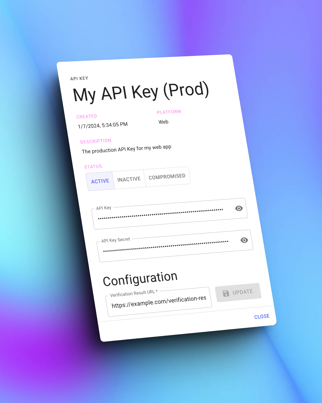
The Veriph.One SDK is configurable so that the interfaces shown to your users match your app's branding. To make this customization happen, you'll need an active API Key registered in the Veriph.One dashboard and start by clicking on it to show its details; then, scroll down to find the styling section, as shown below.
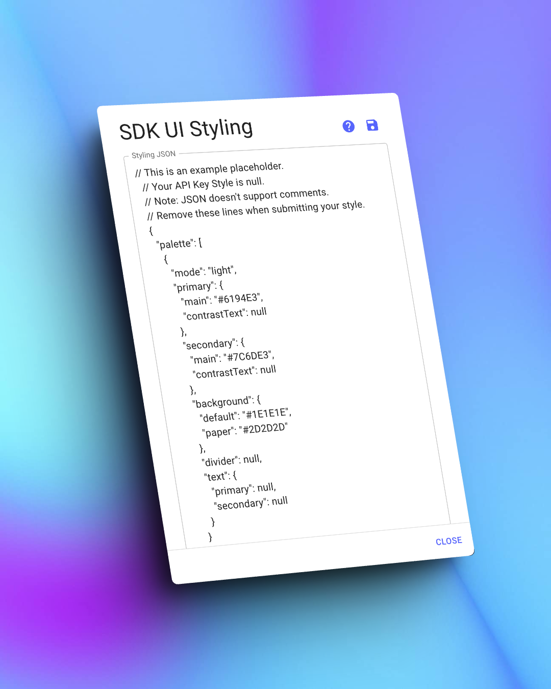
You'll find a placeholder text with a sample JSON for new API Keys or those without style customizations; this text is only an example, and the values aren't affecting the UI.
Start by deleting the comments at the top of the sample JSON; its specification does not support them.
Step 1: Create your styling JSON
A valid JSON string with the necessary fields is needed to customize your UI. Many fields are optional, so you can change only the ones you need.
| Field | Description | Type | Nullable |
|---|---|---|---|
| palette | Controls the colors used for the UI | UIPalette[] | Yes |
| typography | Used to customize the appearance of text elements | UITypography | Yes |
| layout | Defines the structure and style of base elements | UILayout | Yes |
Please consider that the palette property expects an array because we intend to support light and dark palette schemes in the future. Currently, however, the UI will only use the first element of the array.
UIPalette
| Property | Description | Type | Nullable |
|---|---|---|---|
| mode | Defines the type of palette (light or dark) | String constant (values: "light" or "dark") | No |
| primary | Primary accent color for interaction elements | UIColor | Yes |
| secondary* | Secondary color for contrast and emphasis | UIColor | Yes |
| text | Configures the base of colors of text elements | UITextColor | Yes |
| background | Base colors for the UI's backgrounds and layouts | UIBgColor | Yes |
[*] The secondary color is currently unused. If you would like to use multiple accent controls in your integration; please let us know.
UIColor
| Property | Description | Type | Nullable |
|---|---|---|---|
| main | Primary accent color for interaction elements | String with hex value (e.g. #FFFF00) | Yes |
| contrastText | Color of text used over main color (e.g. buttons) | String with hex value (e.g. #FFFF00) | Yes |
UITextColor
| Property | Description | Type | Nullable |
|---|---|---|---|
| primary | Color used for bold or emphasis text in Web, and all non-interactive texts in mobile platforms. | String with hex value (e.g. #FFFF00) | Yes |
| secondary | Color for generic and any non-interactive text. Ignored by Android and iOS SDK's, used by Web only. | String with hex value (e.g. #FFFF00) | Yes |
UIBgColor
| Property | Description | Type | Nullable |
|---|---|---|---|
| paper | Web SDK: Color used for container cards and similar surfaces. iOS SDK: Used for TextField and Picker backgrounds. Android SDK: Unused. | String with hex value (e.g. #FFFF00) | Yes |
| default | Web SDK: Website's default background color (rendered below background image, if any). Mobile SDKs: Used as window, sheet, and dialog backgrounds. | String with hex value (e.g. #FFFF00) | Yes |
UITypography
| Property | Description | Type | Nullable |
|---|---|---|---|
| h3 | Defines the style of titles in the UI. | UITextStyle | Yes |
| h4 | Legacy value. Unused in latest version of the SDK. Defines the style of subtitle elements. | UITextStyle | Yes |
UITextStyle
| Property | Description | Type | Nullable |
|---|---|---|---|
| color | Color used for a specific type of text | String with hex value (e.g. #FFFF00) | Yes |
UILayout
| Property | Description | Type | Nullable |
|---|---|---|---|
| background | Web SDK: Image used as the website's background. Mobile SDKs: Unused element. | UIBackground | Yes |
| logo | Image used to show the client's logo in the verification UI. | UIImage | Yes |
Our UI draws the background image on top of the background color that you configure in the palette field.
UIBackground
| Property | Description | Type | Nullable |
|---|---|---|---|
| type | Defines the type of resource used | String constant (values: "url") | No |
| source | Valid URL or URI to obtain the asset | String (URL starting with http or https) | No |
UIImage
| Property | Description | Type | Nullable |
|---|---|---|---|
| type | Defines the type of resource used | String constant (values: "url") | No |
| source | Valid URL or URI to obtain the asset | String (URL starting with http or https) | No |
Step 2: Test your configuration
Once you submit your JSON string and save your configuration, each new verification session you open using that API Key will have the style you specified.
You can test your customization using a non-production API Key to ensure everything works as expected. Later, you can copy and paste the JSON string to your production environment Key, and the customization will carry over.